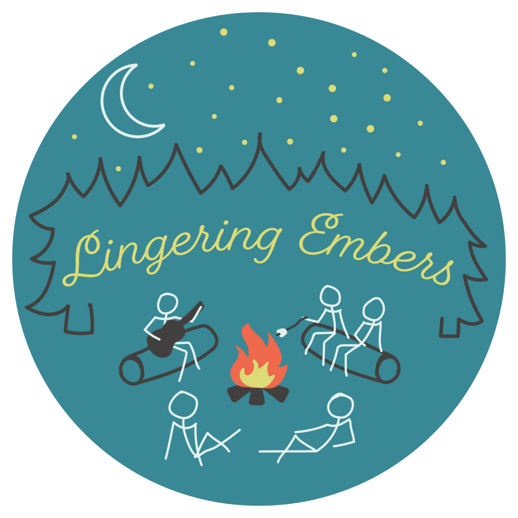
I wrote in January about about how I have an online store of my own, Lingering Embers. But while I had the basics of my shop down (working website, products, etc.), in February I got to finish my most anticipated part of creating my business; making a logo! I am a creative soul, after all.
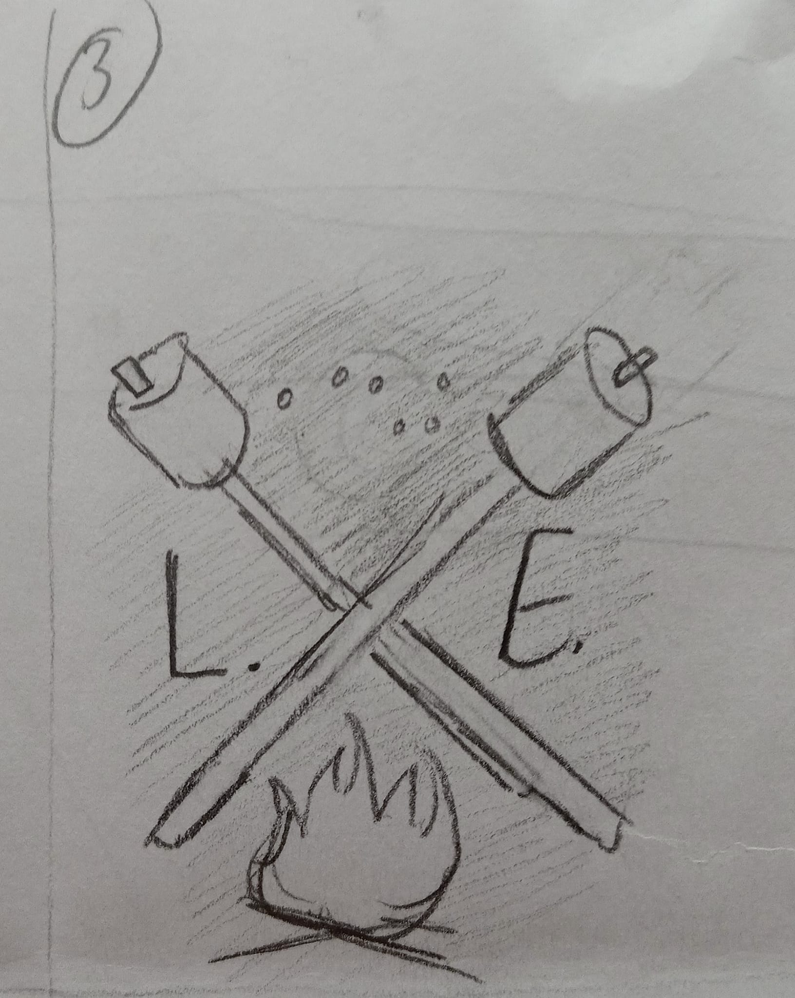
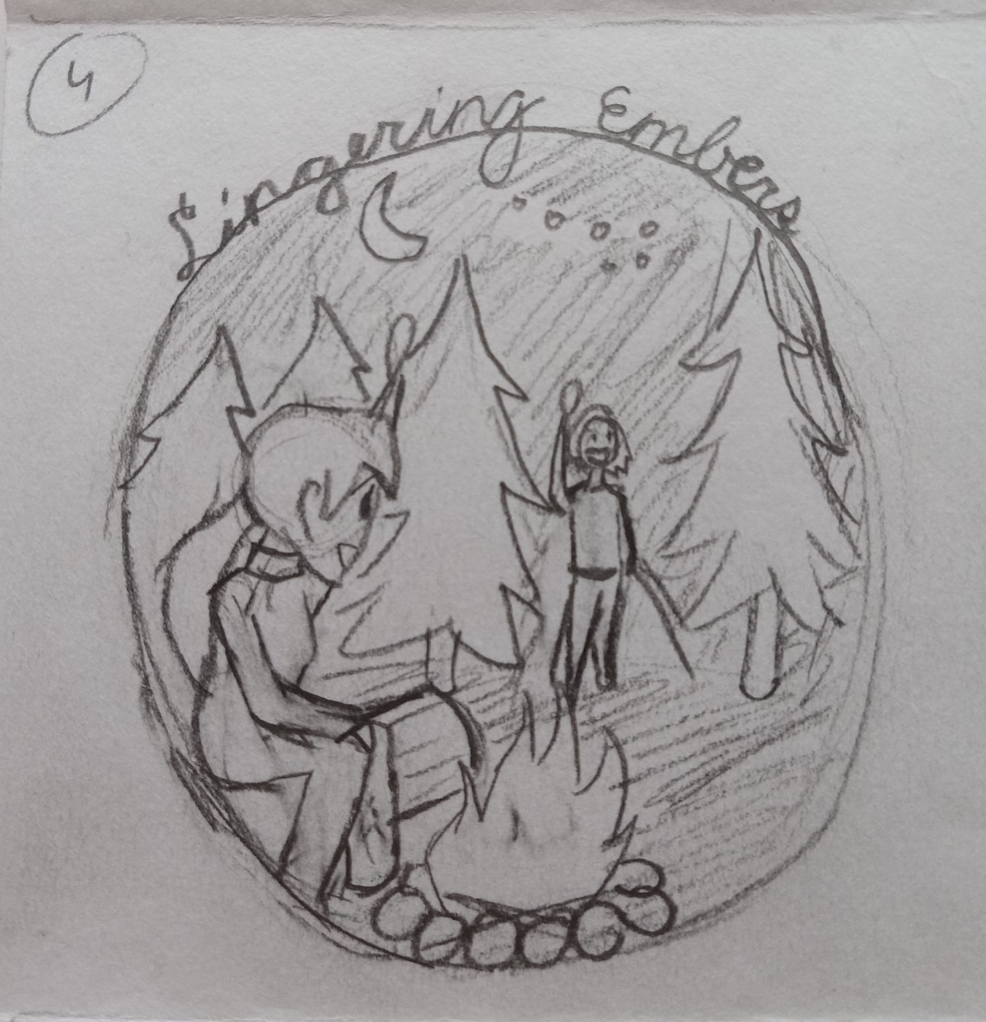
I also shared each step of the process on my shop’s Facebook page so I could get feedback from my audience, starting with the thumbnail sketches I created. With the ’embers’ part of my business name, of course the main through line for my designs was a campfire.
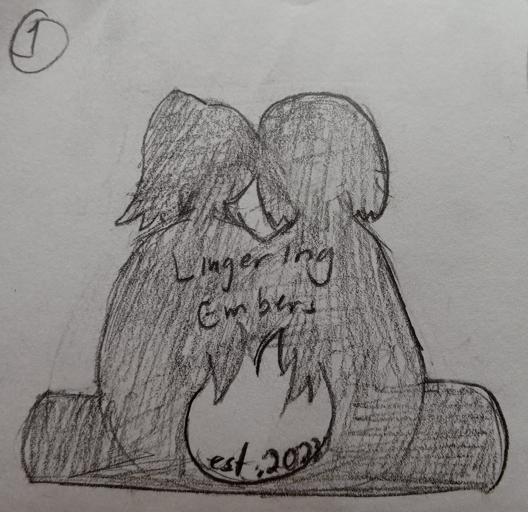

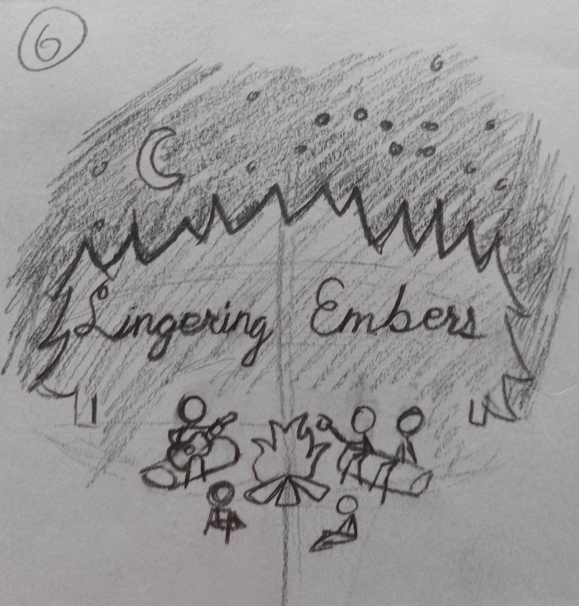
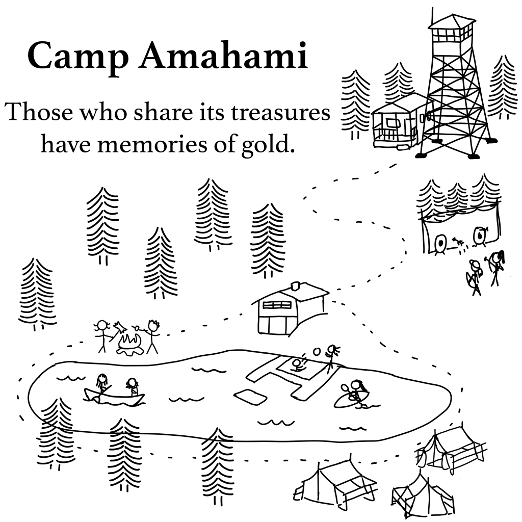
While I did have my heart set on a nice silhouette style logo like in thumbnail #1, the first comment I got when I showed others my designs was ‘It looks like you’re setting their butts on fire’, which came from my own mother. But the one I ended up really liking was #6, with its similarity to the Amahami Stick Figure design I made in December for my shop.
The next step was picking out a good color palette, which I think was the most fun out of everything. I had cheated a bit and looked up pre-made color palettes that others had shared online and made more than a dozen different variations on the logo, but could only pick my 5 favorite to show off on Facebook.
While I like the dark green version of the logo the best, the consensus from Facebook was that the darker blue version was the most eye catching and had the best color contrast, which I have to agree is true. All that was left for me to do was create a cleaned up version of the design and voila – Lingering Embers now has a logo and some nice brand colors!

Leave a comment